
We collect, use and create data on a daily basis. As people, and as businesses. Knowingly and unknowingly. Now more than ever, the smart use of data seems to be what sets successful businesses apart from the rest. How do they do it? Or more importantly: how can you do it?
Over the course of the year, your business will gather a lot of data. And if you’re smart, you will have some SMART goals set up, that are specific and measurable, to start with. To see if you’re on track, or if you need to change your course, you can put the data you’ve collected next to your goals. And the place to do that? A business report.
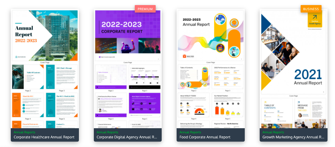
Take data-driven decisions based on business reports
That’s right, it’s time for some good old business reports. They might seem dry and dull, but when done right they serve as invaluable tools to communicate what needs to be done to your team and stakeholders.
Why would you create a business report? It’s very likely that your team is working with various tools and software. You’re collecting data all over the place. It can be hard to get a grip on where the business as a whole is standing, if you don’t combine that data.
Business reports let you do just that: you summarize what has been done or needs to be done in one place. It’s also a great way of tracking progress and developments over the year. By creating and using a consistent format, you can easily track how your business has changed and grew over the years.
What can you track in a business report?
Anything you want, although usability should come first. Not all data needs to be summarized and visualized., after all.
For internal use, you can track efficiency or customer satisfaction. For stakeholders, you can visualize profits and cost-efficiency. There’s basically a business report for any occasion, although you should match it to your current goals and strategies.
Nevertheless, we get that you probably are not looking forward to creating the actual report. Even when you get all the numbers right, you still have to make them look presentable. Not to worry. We’ve found some tools for you that will help you create business reports that aren’t only filled with valuable data, but also look good. Let’s take a look.
In a rush? Here are the options we’ll be reviewing and their main benefits.
- Google Data Studio: great for Google tool lovers. Absolutely free and completely connected to your spreadsheets in Drive, surveys in Forms and data in Analytics for fast visualizations of your data.
- Piktochart: lets you create great-looking reports with easily customizable templates. Great for data visualization, but the free version is limited to designs.
- Canva: the free version goes a very long way. Full of beautiful templates, yet a bit more of a hassle when it comes to working with data visualizations.
- Visme: a solid tool for creating reports that require a lot of graphs and stats. However, the free version is quite limiting.
- Venngage: a simple tool for creating business documents. Great for infographics, but not that great for visualizing data in graphs.
- Colorcinch: an all-in-one platform run from any browser. Great for manipulating images and creating “cartoon” effects.
How to make your next business report your best one yet
Even when working with the best business reporting tools on the market, you’ll still have to keep some ground rules in mind to really make your business report pop. It’s not just a matter of putting all your data into one document and sending it to everyone.
You’ll want to create a business report that is actually effective and drives results. One that is in line with the quality you deliver for your clients — because why not also maintain that standard for internal communication?
- Visualize data wherever you can. Charts and graphs. Infographics work great too.
- Use visual storytelling. Developments over time or goals can also be visualized to be highlighted or made easier to understand
- Don’t overwhelm your readers: don’t put too many graphs on one page, and categorize them properly. The whole point of data visualization is to make it clearer, not more confusing.
- Plan before you start: what’s the actual purpose of this business report? This will not only make it easier to gather data, it will also be more valuable to stakeholders who read it.
- Be consistent: if you create more reports or other content, make sure that your business report is in line with your other content when it comes to design and copy.
- Use active and engaging copy: a business report is not a novel, and nobody particularly looks forward to reading them. Keep your writing short and snappy.
6 great tools for business reporting
We’ve put together a list of six tools you can use for business reporting. All of them have free versions, so you can try them before you buy them, if the upgrade is even necessary. Let’s dive in!
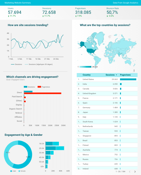
1. Google Data Studio
If you are using Google products for various aspects of your business, you’ll love Google Data Studio. Surveys, spreadsheets, Google Analytics, and Ads — you can easily convert all the data from your favorite tools into visuals such as graphs.
If you’re familiar with Google products, this one will also be a breeze to navigate. Google Data Studio is relatively simple and straightforward in its abilities. In return, however, it’s one of the most user-friendly reporting tools out there. Plus, it’s completely free, making it perfect for everyone just starting out with data visualization and reporting tools.
2. Canva
Canva shows you that reports don’t have to be boring. In their template gallery you find easily customizable examples of reports that will make your data stand out. It’s tough enough to capture and hold people’s attention with data sets, financial records, and survey results.
That’s why Canva revolves around pleasant design, so you can create visually enticing and intuitive reports.
You simply pick a template that matches your style and add your content to it. You can change colors, fonts, layouts, add your own visual elements — or simply stick to what their designers made for you.
Pros
- A gallery full of templates with stunning designs. You probably won’t need the paid version, because the free version has a lot of templates and possibilities. For more storage room and premium options, check their pricing.
Cons
- You can add charts and graphs, but you will have to manually add the data, which can be a hassle depending on the report.
3. Colorcinch
In their own words, Colorcinch is the cooler, down-to-earth stepchild of photo editing – always dependable, fabulously low-maintenance, and ready to prove their worth. Colorcinch is geared towards images, effects, and essential editing tools to include background removal, text masking, multiple layering, and freehand drawing to name a few.
One of the really unique features of Colorcinch is the ability to “cartoonize” an image. The cartoonize effects and filters, take your photo from realistic to any number of cartoon options. If you want to add unique images to your business report, this tool is a great option.
Colorcinch offers a Basic account that is free to use, requires no registration, and provides access to numerous essential effects and features. For access to their premium effects and features, you can choose from a monthly plan or discounted yearly plan. Check their pricing plans here.
Pros:
- You only need a web browser to use. Once you upload your picture, you can use all available tools to change the image.
- You can see the before and after of their AI-powered specialty effects when turning your photos into sketches, paintings and cartoons – all with just a click.
Cons:
- The performance of your editing is reliant on your internet connection. Therefore processing times can vary dependent on your internet speeds.
- When using the free version, if you close your browser before you save the final image on your device, you will need to edit from scratch. The free version doesn’t have the ability to save your work as a project but the premium version does.

4. Piktochart
Piktochart makes visual storytelling a breeze. No eye for design? Simply pick any of their read-made templates and tweak them to match your branding in their reports maker. But Piktochart creates reports that are more than just easy on the eye: they are strong when it comes to data visualization as well.
With Piktochart you turn your data-heavy content into a visual story that your readers will easily understand. You can import your data from Excel or Google Sheets to easily create graphs that automatically update when your data does.
Pros:
- So easy to use that it requires zero training. It’s incredibly intuitive.
- Plenty of options to visualize your data in an interactive way.
Cons:
- In the free plan, you can only create up to 5 active visuals. If you’re looking for more and love their templates, check out their pricing plans.
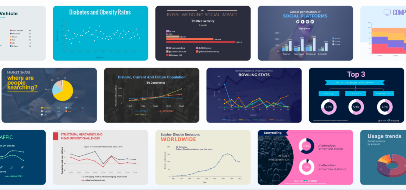
5. Visme
In their own words, Visme is for literally anyone: ‘’whether you’re a seasoned designer or you can’t be trusted with a box of crayons’’. We can’t help but agree – and chuckle. Charts, graphs, reports, presentations and anything in between: Visme makes them look great for you.
Their graph maker comes with a wide variety of options. Their templates for documents will surely inspire you to create a fantastic report. And on top of that, Visme is very easy to use.
Pros:
- If you have a lot of data you want to make accessible through graphs and charts, you’ll find everything you need in Visme.
Cons:
- The free version only allows you to make 5 designs. Plus, the number of templates you can use in this is pretty limited. To upgrade to an unlimited version, check their pricing plans.
6. Venngage
Venngage is all about visual storytelling. That’s why they’re great for anyone trying to make an infographic without ever having followed a design course. It’s a very straightforward tool and easy to use.
In their template gallery, you’ll find every possible type of document you need to run a business, all the way down to postcards.
Pros:
- If you have information you want to communicate via an infographic, Venngage is a great pick.
- User-friendliness is high in this one. You don’t need to be a geek or designer at all.
Cons:
- If you’re focused on design, Venngage might not have enough options for you.
- It is pretty limited when it comes to putting numeric data into graphs.
And there you have it, six tools that will help you power through the creation of your next business report. Explore their (free!) options to find the tool that is most intuitive to you. Good luck!


